Data exploration with Tableau


A place where data can not only be viewed, but also experienced
Working through long tables of numbers is a tedious task that can drive even the most enthusiastic data lovers to the depths of despair. And when it comes to decision-making in the business world, where time is money and the coffee always seems to be cold, you need something with more pizzazz than an endless string of numbers and letters.
This is exactly where data visualization comes to the rescue. Tableau's interface is designed as if someone had decided that data analysis should also be fun. With just a few clicks, the dull, monochrome world of spreadsheets can be transformed into a colorful firework display of insights. A little drag-and-drop quickly turns into a visual journey through the world of data in search of the golden insight shimmering on the horizon.
From data to dashboard: a short step-by-step guide
1. connection to Tableau
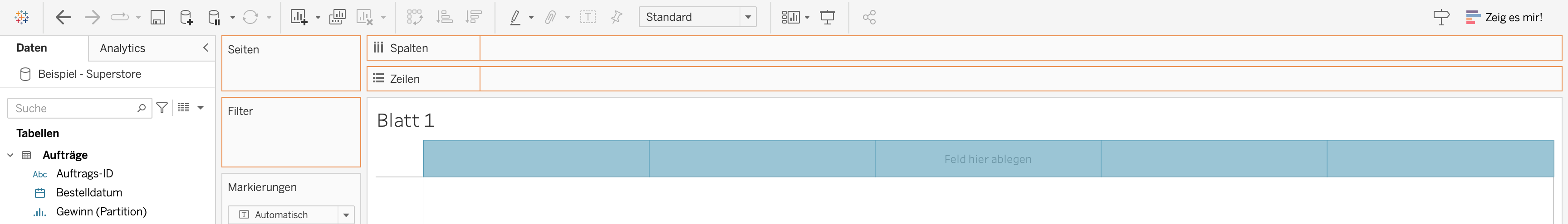
To create smart visualizations from tables, they must first be integrated into Tableau. It doesn't matter whether it's local files, data from databases or sample data sets provided by Tableau - the connection only requires a few clicks and all the lacklustre rows and columns are ready to be transformed into attractive graphics.
.png)
2. creating worksheets
As soon as the data has landed in Tableau, you can breathe a sigh of relief. The otherwise overgrown column names in Excel, which you used to scroll through like an endless labyrinth, are now presented clearly and sorted by data type in the data area of your first worksheet. Even if the term "worksheet" brings back memories of ninth grade math exams, in Tableau it's like your own personal canvas that invites you to experiment with your data using the drag-and-drop function and free the Picasso in you. In no time at all, the black and white mountain of Excel data becomes an appealing diagram. By presenting the data in graphical form, it not only looks better, but also reveals its significance at a glance. Complex correlations reveal themselves in the graphics, whereas poking around in the raw data would have been a tedious way to gain knowledge.
%2520(1).png)
Tableau is software as a self-service and offers you a stage on which you can simply try things out to see what happens. As an improvisation artist, you click together the desired fields using drag-and-drop and are just one click away from discarding the plan and starting again. And to make it even easier, Tableau guides you with a gentle hand and shows you exactly where on the workspace you should place the fields, or uses the "Show me" function to conjure the desired graphic out of a hat itself.
3. creating the dashboard
Once all the worksheets have been filled with visualizations, the magical moment comes to combine them in a dashboard. In classic Tableau style, a world of creative freedom opens up before you in terms of the look and feel of the dashboard. In the initially empty dashboard, you can arrange graphics with pixel precision and, with a touch of formatting flair and a carefully selected color palette, design and paint each graphic to your personal taste. Every movement, every click and every color choice counts. And as you combine your visualizations in a way that complements each other, an informative as well as aesthetically pleasing work of data art is created before your eyes. Now you can step back and admire the masterpiece you've created - ready to tell the stories that lie hidden in the numbers.
%2520(1).png)
4. deployment on Tableau Server
The time has come to throw open the doors to the opulent data gallery and invite others to experience the beauty and clarity of the data in full bloom. Interactive features allow users to take control of the dashboard and make adjustments in real time. The use of filters, hierarchies and drill-down features provides the flexibility to explore and analyze data on multiple levels as needed. This allows users to try out different views and tailor the dashboard to the information that really helps them. This quietly and gracefully opens up an ever-expanding space where questions are celebrated and answers are danced. A place where data can not only be viewed, but experienced, in all its fascinating and insightful glory.
%2520(1).png)
Tableau vs. Power BI: Different focuses and a promising future
Tableau is characterized by its user-friendliness. If you compare the tool with its biggest competitor, Power BI, it impresses with its intuitive nature and turns data exploration into self-service. Power BI, on the other hand, focuses on seamless integration into the Microsoft product landscape. With its integration into the Salesforce landscape, Tableau can also be expected to do much in this direction. Salesforce is also positioning itself for the future with Tableau GPT. Perhaps in the hope of creating a time when dashboards create themselves while we humans enjoy our coffee before it gets cold, accompanied by countless mouse clicks. So, what are you waiting for? Grab your data and get ready for an adventure!
This article first appeared in a modified form in issue 02/23 of our magazine data! You can find all issues and articles here.